On the principle of composition in the design of binding (2)
Two color composition
Color composition is a discipline that studies the generation of color, human perception of color and its application. It starts from the perception and psychological effect of color, and uses a certain color law to combine the interrelationships between the constituent elements and create new ideal color effects.
The colors in the paintings advocate the contrasting and changing of colors such as hue, chroma, light and shade, coolness and warmth, and area. The method of painting color is very suitable for the color of the cover design. However, the cover design is a decorative art. The art form itself determines the decorativeness of its color. Even with the use of painterly color means, it must be involved in the decorative qualities, concise, general, subtle, and exaggerated. It is neither a natural reproduction nor a suitable smear.
In the decorative design, the color of the feelings, color association is extremely important. The artistic emotion of the cover cannot be represented by the image alone, but there must also be a color concerto in order to form a harmonious and beautiful tune. Warm colors give people excitement, cool colors give people a sense of silence, and black and white give people a sense of tension. This "inherent feeling" of color will directly imply the reader. When we see color, we often think of things that are related to color. For example, white is associated with sacredness, red is associated with fiery, green is associated with freshness, and so on. This color connection is obtained by linking memories or knowledge of past experiences.
On the cover of the magazine "DANCE", with the purple-gray as the keynote, the dancers wore dark purple dresses with a floor area, complemented by a very small area of ​​yellow as complementary colors, demonstrating the grace of the dancers and the tranquility of the stage.
In the actual work of the cover design, important issues such as color, area size, and color configuration are also encountered. The color scheme of the cover design, that is, the color composition, must pay attention to the following points to improve the visual effect.
1 Background color and graphic color of the cover
In the cover design, the color as the bottom is only a negative perception, so it feels far away; and the color of the configuration of the figure is the first to attract the reader's eye, then people feel positively, so there is a sense of closeness. This phenomenon is called graphic effects. When designing, the background color and the pattern and text effect on it are affected by the color relationship. The cover of "Graduation Flow Statistics for Beijing's College Graduates" shows that the background color and the configuration of the graphic colors are sufficient to illustrate this point. The graphic color is brighter and brighter than the background color, but the area is small, and the dark or low-purity graphic color area is large.
2 The overall tone of the cover
The overall color is represented by the overall color arrangement. The overall tone determines the design's vitality, robustness, coolness, or warmth. "Fashion Health 4 Anniversary" magazine uses green and yellow as the overall tone to express the tropical environment, sunshine and health of the character.
3 Cover color balance
When color matching, the strength of the color, the feeling of lightness will affect the size of the area of ​​the color and form a balance. The purple with the lowest lightness is the purest, the largest, and the white with the lowest lightness is the smallest.
4 The focus of the cover color
The so-called emphasis is to use a certain color as a key point to highlight this color. In color matching, the overtones of several colors will make the picture appear weak and monotonous. To emphasize the point, you can use a hue to behave more strongly, but pay attention to the harmony with the entire hue, the area should be minimal, and balance with other colors. The cover of "Sentimental China" added a small area of ​​Chinese Red in the grey tone of the painting, making the picture more viable in quiet.
5 The rhythm of the cover color
Rhythm, that is, rhythm. The color arrangement produces an overall tone. When arranged in three colors of strong, medium, and weak, a staircase effect is produced, that is, a gradient. If you are strong, weak, medium, or medium, weak, and strong, you will have a rhythm in the hue. Repeated or intertwined hue, light and shade, and strength will produce repeated rhythms. Rhythm, related to the configuration, shape, texture, etc. of the color.
6 color gradient
In a multi-colored fit, the gradual change of the ladder is a gradual change. When two or more colors are not reconciled, several colors of the step change are inserted between them to make them harmonize. Gradient hue gradient, brightness gradient, and purity gradient. The combination of these three gradients, can constitute a variety of complex gradient effects.
7 The overall tone of the cover
For the overall unity of multi-color coordination, and use a color to dominate the whole, this color is called unified color, which is the dominant color. There are three kinds of uniform adjustments, that is, adding the same hue in each color, adding white and black to make the hue brightness similar to the brightness, and adding gray to make the purity of hue purity similar to the three. "There is walking between heaven and earth" is the use of yellow gray tone to dominate the entire picture, there are dominant colors in the graphic color, resulting in a soft tone of coordination, a touch of bright yellow on the sky in the distance, a good expression of the book's artistic conception.
8 Cover Color Matching
The two color areas are larger, and the hue or lightness and purity are very similar. Although they are harmonized, they are too weak. On the other hand, when they are in opposition, they show a contrasting state, but the effect is too strong. For adjustment, other color divisions must be used to divide and separate these colors.
In summary, the two principles of plane composition and color composition are the media for visual communication between the designer's perceptual stage and the idea of ​​the visual appearance. It is also a bridge to communicate with the reader's mind and has a high guiding value in the design of book binding. .
Source: Art and Design Yu Xiaoyan, Shanghai Maritime University
We offer a wide range of plastic accessories with beautiful appearance and high quality.
Because the shape of the Plastic Lobster Clasp Hook resembles a lobster, so it is also called Plastic Lobster Claw Clasp.We have different colors of Plastic Lobster Clasps to choose from, the transparency is also different, if you have the color you want, you can contact us to customize.
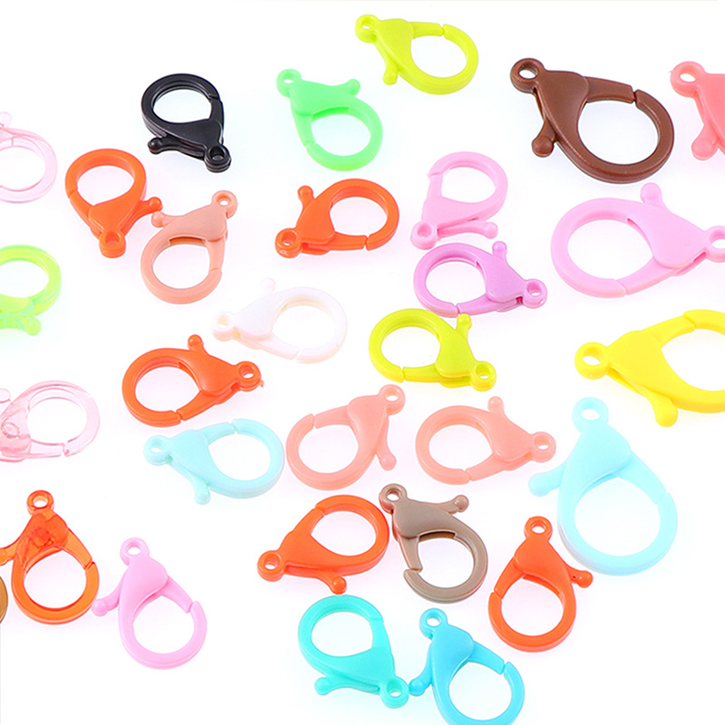
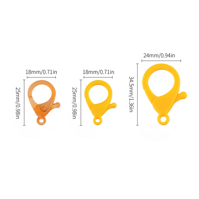
We have different sizes of Plastic Lobster Clasps, and we can also customize the size you need.
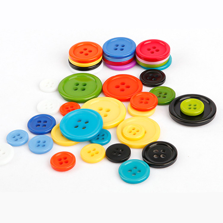
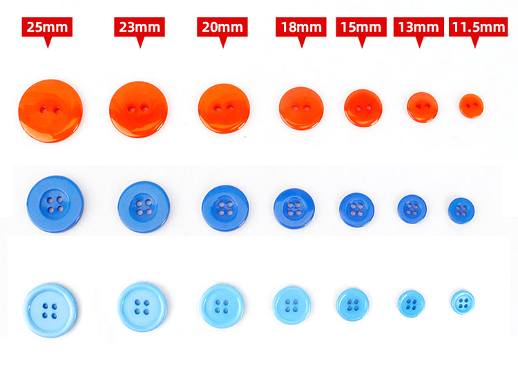
2.Plastic Button
3.Plastic Chain
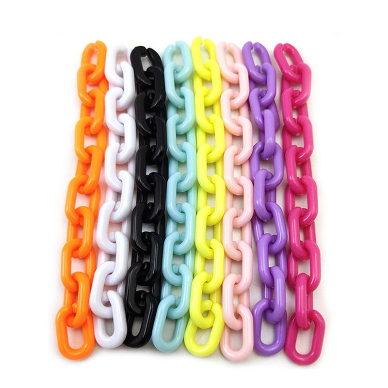
Our plastic chains have a wide variety of styles, not only in different colors and sizes, but also special chains, and the length can also be customized, welcome to inquire.
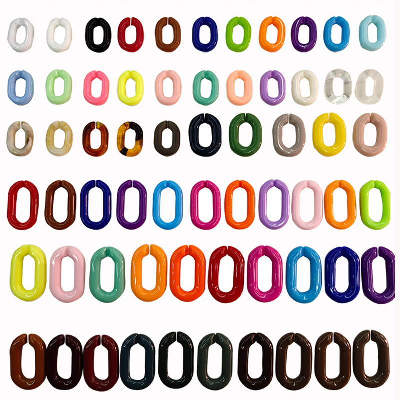
There are many other styles of plastic accessories, come to consult us for more new information about plastic accessories.
Plastic Snap Hook,Button Plastic,Plastic Chain,Plastic Lanyard Hooks,Plastic Lanyard Hook
Shenzhen Yiyixing Zipper Manufacture Co.,Ltd , https://www.yyxchina.com