The grasp of the packaging design skills
In the taste of many goods packaging, the consumer is not satisfied, or even bored, directly affecting the sales of goods. Under the current market conditions of brutal competition, it cannot be said that it is a kind of containment for merchants or manufacturers. Naturally, it also affects the economic benefits of merchants or manufacturers. This is mainly due to the basic quality and design level of the product packaging designers, which leads to the taste of the packaging design. The taste of the packaging design is mainly the skill of the packaging design. If the skill is grasped, there will be no problem of the grade and the top.
So, what should be the mastery of packaging design skills? There are three main points here: one is the grasp of color skills; the second is the grasp of composition skills; the third is the grasp of cultural connotations.
First, the grasp of color skills
Color techniques should pay attention to the following points: First, the relationship between color and packaging; second, the contrast between color and color itself. These two points are the key to color application.
(1) Color and packaging care
So, what should be the relationship between color and packaging? Mainly through the external packaging color can reveal or reflect the inner packaging items. It allows people to basically perceive or associate with the inner packaging as soon as they look at the outer packaging. I have mentioned this issue many times in the past articles, but if we can walk into the store and look at the goods, many goods have not reflected this kind of care. It is impossible for consumers to think about what the packaged items are from the table. Of course, it does not play a positive promotional role in the sales of products. The color of normal external packaging should be such that the same characteristics are grasped to varying degrees;
(1) From the industry, the normal color of food is expressed in the main colors of goose yellow and pink, which gives people a sense of warmth and closeness. Of course, there are many kinds of tea, green, beverages, green and blue, wine and cakes with a lot of red, children's food with a lot of rose, and daily cosmetics. The main color is mostly rosy, pink, light green, light blue, dark brown, to highlight the warm and elegant feelings, clothing, shoes and hats are mostly dark green, dark blue, brown or gray, to highlight the calm Heavy elegant beauty.
From the performance characteristics, in terms of food alone, cakes and snacks are mostly made of gold, *, and light*, giving people the impression of scent; people such as tea and beer use red or green, which symbolizes the richness and aroma of tea; Tomato juice and apple juice are mostly red, and the concentration indicates the natural properties of the item. Although some packages are not similar in color to the main color as described above, if you look at the design of the package yourself, then in the picture of its outer packaging. There is a symbolic color block, color point, color line or a concentrated content highlighted by the color of the pen. This should be the pride of everyone. Some of the clothing packaging and some cosmetic packaging, and even some wine packaging can find many such examples.
(2) The contrast between color and color
Besides, the contrast between color and color. This is the easiest thing to do in many product packaging, but it is very difficult to grasp. In the design from the master, the wound effect of the package is the spring snow, and vice versa, the lower Liba. In Chinese calligraphy and painting, such a popular saying is often called impenetrable. What is actually said is a contrast relationship. In the packaging design, this contrast is very obvious and very common. The so-called contrasts generally have the following contrasts: the contrast of color use, the light and heavy contrast of color use, the point-to-face ratio of color use, the contrast of color use, the contrast of color use, and the contrast of color use. Contrast and so on.
(1) The contrast between the use of color.
This occurs most frequently in the color of current packaging designs and is the most widely used. In many graphic designs (referring to posters, hanging paintings, or situational binding classes) is very common. The so-called contrast between the depths and the depths should be that the two colors in the design color appear subtly on one kind of picture at the same time, resulting in a more harmonious viewing angle effect. Usually used as a large-area light-colored foundation, on which a dark-colored composition, such as a light-colored foundation, is patterned with brown, or a pale yellow or white pattern line is used in a brown color block; Light green paving; dark green composition; pink bottoming; large red composition; light gray bottoming; soap black composition and so on. These are the shades of color used. In this form, we can design the packaging on some cosmetic packaging or some Western wine packaging, especially in Western European wine packaging. China's Changyu wine and Shuanghui's method of sausage and CJ's meat packaging are mostly expressed in this form. This form of packaging is also common in Japan and South Korea. The visual effect it displays is bright, simple, gentle, and elegant.
(2) Light and heavy contrast (or shade contrast) of color use is also one of the important reproduction methods in the use of packaging color. This kind of light and heavy contrast is often used to set off a dignified theme pattern with a light and elegant background, or in a dignified theme pattern (more weight in the color block pattern). The theme and name of the light and elegant packaging, as well as trademarks or slogans. Conversely, it also uses a large area of ​​damp and deep pigmentation. In addition, use a light or elegant tone or concentrate on a certain color block or fully decorate some patterns. In this light and heavy contrast, the general pigments have a coordinated color contrast and a contrast between cold and warm colors. The method of coordinating color contrast is often light green to dark green; light * dark coffee; pink to red, etc., while the contrast between cold and warm colors is mostly Black and white, red and blue, etc.
(3) The comparison of the point-to-face ratio (or size contrast) of color use, mainly in the design process of a package picture, using the contrast of pigments from a center or concentrated point to the overall picture, ie small range and large range The contrast between the pictures. In daily life, especially in the washing and cosmetics products, we can see that the entire area of ​​the box is clean and there is no such thing as a very small square of heavy color (or The elliptical or small round shape) then reflects the theme of the brand and the name of the package content from the picture of the small square. This is a combination of point and face, and a contrast between big and small, and occasionally from point to point. And the gradual transition of the comparison.
(4) A simple comparison of color usage. We can see the unified 100
Instant noodles, on the bottom of the bag, the lower half is the physical pattern of every instant noodles, but at the upper end of the picture is the whole clean, big green red color, then the "100" is prominently highlighted, then look The cover of the 66th issue of Packaging World magazine (also called the packaging of the book). Using a large area of ​​straw to make a real photo, it seems very complicated and even the four words of the packaging world are complicated, but the center position of the positive picture shows a round blank space. In it, it is marked "This magazine will expand the expansion in 2000" "Welcome to the local post office to subscribe." It's so simple and simple, but ingeniously and independently put the most important ideas that the magazine needs to express. I have also seen a dumpling bag and a seasoning bag in the store. The whole picture is green and black and interlaced on one screen, which means that the trademark is forced to be impatient. I also want to express the name, but also want to express the foil pattern. As a result, the large-scale complicated design does not have any practical meaning of the dark lining pattern, and the main body of the above description is completely diluted, drowning, resulting in such packaging. A person's psychological repression and irritability also naturally affect sales.
(5) The contrast between the use of color and color is mainly to highlight the elegance of the popular words. This kind of vulgar expression is carried out in the "dirty" chaos and disorder of color (in fact, the originality is very ingenuity, some Western oil paintings are very much about this performance - that is, modern abstract art). This kind of composition is either a symbolic revelation of the theme or a service for the theme "dry lotus".
Make a little red in the flowers. As if on a packaging screen, it seems to be indiscriminately messing up or throwing a mess of colors on it. Then quietly glimpse the theme of the pattern on the side or in the clever location. This is a very interesting thing. In addition to packaging, even book bindings, advertisements, posters on posters, and casual sections on TV have tried this.
(6) Contrast contrast of color usage. This contrast contrast is essentially a contrasting effect formed by the various pigments themselves. This contrast effect is usually expressed as: contrast between light and dark (or contrast between yin and yang), like China's easy-to-light map; contrast between cold and warm, such as contrast between red and blue; contrast between motion and quiet, such as light and calm background and lively jump Pattern text contrast: light and heavy contrast, such as deep pigment and light pigment contrast.
The comparison of these colors is entirely due to a way in which a pattern needs to be expressed by contrasting different colors, but this pigment is an indispensable object that constitutes the entire packaging pattern element, and some patterns are even different. Ingenious combination of pigments. Therefore, in the process of studying packaging design, if you do not pay attention to the contrast between color and color, you can't talk about designing a good packaging pattern. [next]
Second, the grasp of composition skills
Just like the grasp of color techniques, the techniques of composition are more diverse, and the relationship between the two is interdependent and mutually expressive. But color is the foundation, and composition is the process and the ultimate goal. So composition is important. In the process, in addition to a certain skill, but also pay attention to its visual effects. The effect is the ultimate goal.
(1) Grasping the composition skills
The techniques of composition, in addition to the comparative skills in the use of color, need to learn from the mastery, but also need to consider several contrasts. Such as the contrast of composition techniques, the far and near contrast of composition techniques, the contrast of the composition of the vegetables, the static contrast of the composition techniques, the contrast of the composition techniques. Ancient and modern comparisons of composition techniques.
(1) Contrast of the composition technique: the so-called thickness contrast refers to the color used in the process of composition and the style formed by the pattern of colors. In the paintings and paintings, we know that there is a meticulous and freehand brushwork. Or, the meticulous brush and the freehand brush appear on a picture (like the Chinese cabbage master Qi Baishi's cabbage and enamel painting), this style is a kind of expression technique often used in packaging in the packaging composition. For this thickness contrast, some of the main pattern is contrasted with the foil pattern; some are the contrast between the center pattern and the background pattern; some are rough as the wind sweeps the clouds, while the other side is fine and fine as the hairspring; some replace the pattern with the calligraphy of wild grass This can be seen anytime, anywhere in some alcohol and food packaging. This is the case with the brand name dumplings and the resilience brand shampoo.
(2) The far-near contrast of composition techniques, in the composition of Chinese landscape landscapes, the near-field perspective, and in the design of the packaging map, the same principle should also be the composition level of several screens in the near-middle. The so-called near, is the most eye-catching part of the picture, also called the first visual impact, this most eye-catching is also the most important content to be expressed in the packaging pattern, such as the first instant noodle packaging used by Shuanghui, the first Into the people's sight is the Shuanghui trademark in the blank background and the white double-character Shuanghui (the close-up view) in the background of the dark red square. In turn, it is the smaller "red roast beef noodle" book. (It should be said that the second line of sight, also called the medium shot), is again a product photo (also called the third line of sight, in the middle of the scene) that expresses the contents of the package, and then the auxiliary corporate mascot slogan. Performance description, corporate logo, etc. This obvious layering is also called the three-step rule of vision. It emphasizes the most important expression from top to bottom and right to left while taking into account people's habit of examining a still life picture. The theme section. As the designer at the beginning of the creation of the picture, the production should first understand the theme of the appeal, create a star-studded moon, stand out from the crowd. As a result, the image of my design is like a powerful magnetic force that pulls the sight of the salesman tightly.
(3) Contrast and contrast of composition techniques: Speaking of the dense contrast of composition techniques,
This is very similar to the simple and contrasting use of color, and it is also the same as the flying white in Chinese painting, that is, the concentrated place in the pattern must be accompanied by diffusion, and should not be concentrated or spread. Reflecting a kind of sparse coordination, clear rhythm, there is a relaxation, showing ethereal. At the same time, the theme is not lost. Recently, the author has seen a lot of packaging patterns in the design, the whole picture is dense and colorful, from the background pattern to the theme pattern are all very heavy color performance, people feel pressure and can not pass through the chlorine, so that not only can not beautify Products, the purpose of promoting sales, but not letting people get bored and lack appetite. This is caused by the lack of confidence in the contrast.
(4) Static and dynamic contrast in the composition technique: In a pattern, we often find this phenomenon, that is, an explosive pattern on the background or the periphery of a package theme name or carelessly. In fact, a few crazy thick lines deliberately painted, or ribbon-shaped English or patterns, etc., all show a "dynamic" feeling, while the theme name is dignified and the background is light and calm, this The scene is a contrast between static and dynamic. This contrast avoids the fancy and too quiet rigidness of the branch. So the visual effect is comfortable. In line with people's normal aesthetic psychology.
(5) The contrast between Chinese and Western in the composition technique. This contrast often uses the combination of Western painting's cartoon techniques and traditional Chinese techniques or Chinese Sinology art and English in a package design. And the pictures on the screen directly in the real way to highlight the Western photos or a picture on the packaging pattern, this form of expression is also a common way of reference, which is on children's products, women's socks, clothing Or cosmetic packaging often appears.
(6) The contrast of composition techniques: there are both the use of the ocean for the present and the use of the ancient, especially in order to reflect a cultural taste, the performance of the packaging design is often used in the ancient classics, calligraphy, figures, patterns On the current packaging, this is most clearly shown on the packaging of the wine. For example, the red wine dream twelve gold é’— é’— 图 çš„ å’Œ å’Œ å’Œ å’Œ å’Œ å’Œ å’Œ å’Œ å’Œ å’Œ å’Œ å’Œ å’Œ å’Œ å’Œ å’Œ å二 å二 å二 å二 å二 å二 红 红 红 红 红 红 红 红 红 红In addition, there are some high-end gift boxes for cosmetics and daily necessities. The patterns and patterns of the gift boxes are also looking for grafting techniques from classical culture. This can give people a quaint, elegant intrinsic pursuit or a certain aspect of comfort. Therefore, the people are very popular with consumers. [next]
Third, grasp the cultural connotation
A good packaging design must be comfortable, and there is a pleasing aesthetic satisfaction. Therefore, several aspects of the above proposed design techniques, in the final analysis, in order to achieve this kind of satisfaction. In addition, the core of this satisfaction can not be less than a certain cultural connotation. This kind of cultural connotation is just like a person's temperament and cultivation, giving people an inner charm, which gives people a lot of room for recollection. The packaging design of the special ham sausage of Shuanghui Wangzhong fully embodies this feature. The main image of Wang Zhongwang's product is a sitting lion, except that the product is a fine top grade, in the same family. It is also known as the king of the king, but also shows that the Chinese nation, such as the Eastern lion, is proud of everything, and the world is no longer a "sick man of East Asia". It also shows that the development of enterprises is full of hope and belongs to the growing culture. content. Because, this package is very intriguing. Of course, there are also a lot of packaging, only giving people a colorful impression. Or just a product name, telling you what is inside, this kind of packaging is either a low level of designers, it is not a high-level cultural person, and the product itself is not upscale, not even Besides, high added value, therefore, this package does not contain any vitality. Therefore, a good product packaging, or need to inject a certain cultural connotation, especially represents the connotation of the product culture, or the pursuit of the company's philosophy: either has a certain symbolic meaning, indicating a problem: either implies a certain The point of appeal, what kind of revelation is given, or a specific color representing a company, a special word, or an attribute representing the product. If a package design does not have the above, it is not a successful packaging design, so I said that in another article, the "Basic Quality of Packaging Designers" will be strengthened. Designers must read through the books. To cultivate and improve the aesthetic level, we can design a good packaging work that is popular with the public.
In short, the packaging design skills, in addition to the color, pattern and cultural connotation needs to be grasped, the designer is required to learn from life, learn from the masses, learn from the market, and constantly understand and study the consumer's Demands and aspirations, the practicality of people's lives, and the aesthetic and enjoyment of life are the same. Only in this way can product packaging design continue to raise new levels and sublimate to a certain new taste, in order to promote goods under market economy conditions. Play an important positive role.
Article source address: http://
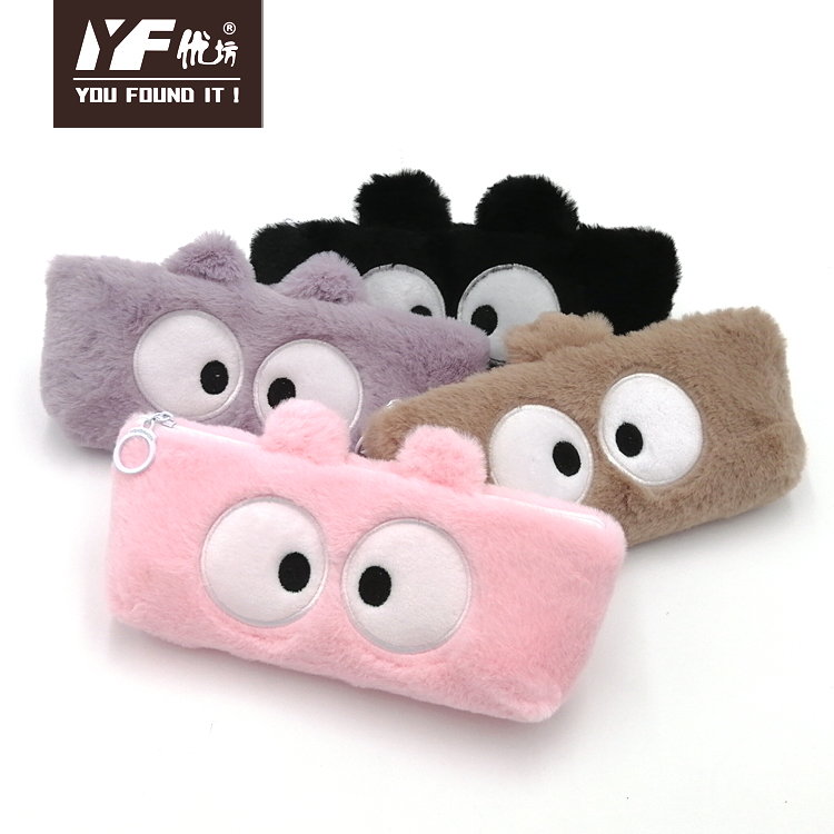
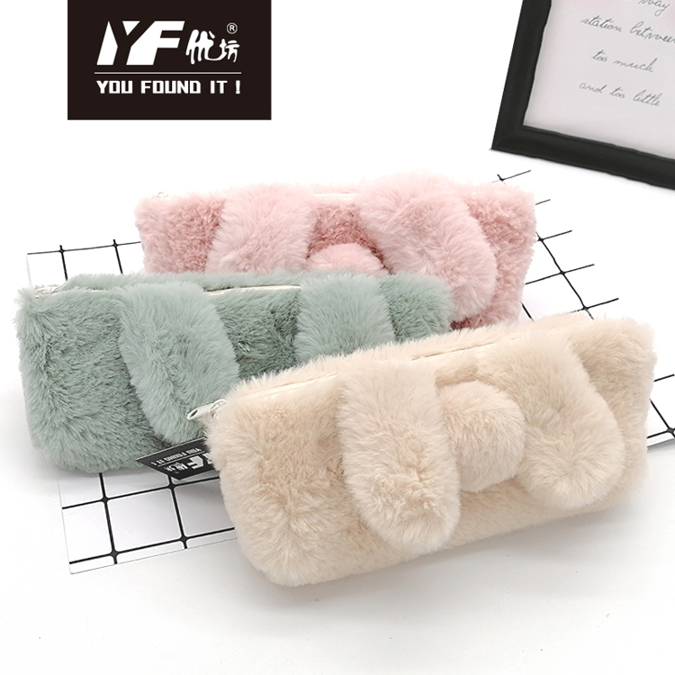
The Plush Pencil Case can be used to hold pens or other small stationery, which is more convenient to carry than pencil case, more comfortable to handle, and easy to clean. It can pack as many things as possible in the smallest space, which is very popular among students and office workers. , can also be used as a Storage Bag, is a multi-purpose storage supplies.
Jilin Y.F. Imp & Exp Co., Ltd is an exporter and manufacturer (Cang nan Y.F. Stationery & Gift Co., Ltd.)in Creative products, such as Backpack ,Shoulder Bag,Pencil Case, Handbag,Multifunctional Bag. Coin Purse .Cosmetic Bag.Storage bags. File Holder .Canvas handbag and Notebook etc. which is a professional stationery company setting research and development, producing, sales and trade into one. Our company always takes quality, service, efficiency and innovation as our management philosophy. Since our brand Y.F. has been put on the market, the products sell well throughout the country consistently, and be exported to Europe and America,, and South America countries as well as regions, where the product enjoys great customer loyalty and good population. Choose Y.F. is not to choose a batch of stationery, but to choose a commitment and responsibility, Thanks for your attention, support, trust an cooperation. Wish to establish long-term business relationship with you in the near future.


Plush Pencil Case,Pencil Case Essentials,Plush Pencil Pouch,Plush Unicorn Pencil Case
Jilin Y.F. Import & Export Co.,Ltd , https://www.yfpencilcase.com