Magical use of packaging colors
The color of packaged goods is aesthetically pleasing, and it is an important aspect that constitutes the value of goods and aesthetic value, and it is also one of the important factors for evaluating the quality of goods. The color of the packaged goods is given a special role, which can have a tremendous impact on human psychology and is seen as the most attractive expression means. It can influence people's emotions, emotions, and behaviors. It also shows beauty factors in the material civilization and spiritual civilization of human life. It is also an important factor that causes purchase desires and promotes consumers' purchasing behavior. Color appropriate talents will be favored by customers. In today's perceptual consumption era, for a product that can cause goodwill, the entire purchase decision-making process is short-lived, because in the face of colorful oceans of goods, consumers do not have more time to consider and can only do products instantly. Reaction. This packaging color can serve as an important role in attracting impulse buying.
Color can combine its physical properties with the human sensory experience from three basic aspects: concentration, brightness, and hue. In general, the darker an object is, the deeper the impression it gives; the brighter the color, the more people think it is closer than it actually is. Red, orange and yellow are generally considered to be energetic and outward-looking; green, blue and purple are more peaceful and more introverted. Color can give people a rich association. Red means joy, vitality, happiness, happiness, love and warmth. It is considered to be risky, sociable, exciting, powerful and protective; yellow is seen as Hope, joy, wisdom, authority, love, and wealth; green and blue are considered peaceful, safe, laid back, and calm; white is usually considered cheerful, happy, lively, pure, and naive.
Color combinations often also become a unique identification. Some foreign airlines use a combination of reddish-brown and brown soil, which makes people think of the desert. A combination of colors that is the same as the color of a country’s flag will make consumers think of the country’s products. Using red, white, and blue at the same time will create a "pure US" image; red, white, and green combinations will reflect the Italian image because their flag is composed of these colors.
Colors not only have a positive effect, but also have a negative association. Black represents silence, power, luxury, contemplation, and bravery. At the same time, it can be reminiscent of horror, despair, sadness, and sometimes considered impure and sinful. While white produces clean, crisp, it is easy to think of mourning, showing weakness, and surrendering. The negative effect of red is to create insecure associations. Therefore, in the design of commodity packaging and even commodities, we should pay attention to its advantages and conceal its disadvantages in the use of color.
The same color has different effects. Because people have different social roles and different cultural backgrounds, their understanding and preferences of colors are not the same.
In terms of gender and age, young children generally like red and yellow, children like red, blue, green and yellow, young people love blue, red and green, and like middle age, they like purple, tea, blue and green, and men like it. Solid, strong, warm colors, women love soft, elegant, lyrical tone.
Colors in different geographical locations produce different effects. People in the northern hemisphere feel less sensitive to changes in nature, prefer soft and bleak hues, and people in the southern hemisphere tend to accept changes in the natural environment, and love a strong, vibrant color. A color researcher in Italy once measured the sunlight in Europe and found that the sunlight in Northern Europe was close to the bluish daylight color, while the sunlight in southern Europe was slightly yellowish. People have long been accustomed to living under a light source, and they have a habitual preference. For example, Italians love warm colors such as yellow and red.
Countries are different and people’s preference for color is not the same. The Americans particularly like yellow and red, which is highlighted by the color of the Kodak color film package. The Japanese people’s love for white, gray, tea, black and green accounts for more than 70% of the national population. Therefore, the color of the skin on the Fujifilm photo is slightly whiter. American college students prefer white, red, and yellow; British men love colors in the order of green, green, red, white, yellow, and black. The order of women is green, blue, white, red, yellow, and black. Red in our country, in the eastern national symbol of celebration, warmth, happiness, etc., is the traditional festival color. Green is the most popular color in Islamic countries, symbolizing the color of life. However, in some western countries, green has the meaning of 妒嫉. Yellow is the brightest and is often associated with luminaries. It is used exclusively by the emperors in the feudal society of our country and ordinary people are not permitted to use them. In ancient Rome, yellow was also valued as the color of the emperor. However, in a Christian country, it is considered to be the color of the traitor Judas. In Islam, yellow is seen as a symbol of death.
Different nationalities in our country also have different aesthetics. Because of the unique geographical conditions and historical, economic and humanistic concepts and traffic obstructions, ethnic minorities have caused the ethnic minority's lifestyle and aesthetic concepts to be closed for a long time. Therefore, in the aesthetics of product modeling, product packaging, and patterns, there are always silent language of their own understanding and their respective ethnic expressions and sustenance, reflecting the different ethnic groups
Beauty psychology. For example, Hui people often wear white hats; Koreans mostly love white clothing; Miao people like to use soft satin as their material, and they love black colored flowers in color, and they are especially fond of bright colors such as rose, green, golden, cobalt blue, and snow. The Mongolian people like hard satin, Keli satin and other textures thick and smooth, the background color is coffee, dark blue, dark green, bronze and other dark textile fabrics. The unique aesthetic features of this nation are all formed due to the uniqueness of its traditional culture, with its own ethnic and regional characteristics. The aesthetic psychology formed by this traditional culture is hardly erased from the psychology of all ethnic groups and has strong vitality.
The application of color. The use of color in the packaging of goods, the use of color in the product itself, in a sense, the color is the face of the product, for different products and different customer groups, in the packaging of goods directly use different colors, can play a finishing touch effect. In the book “The Test of Colorâ€, the exclusive chapter introduces the special use of color in determining the personality of a product. The book talks about candy sellers that must be blue containers or at least blue on the packaging before they are easy to sell. Green is a taboo for candy colors because blue is sweet and green is sour. Similarly, color is more prominent in apparel, cosmetics and other products. In specific applications, in addition to discriminating based on the age, gender, etc., mentioned earlier in this article, special attention should be paid to the influence of cultural backgrounds. The French have a strong sense of disgust towards the green packaged goods or textiles of the Asher, because it is reminiscent of Nazi military service. Generally, men love navy blue and women like pink. The Germans are particularly disgusted with the purple-pink, pale-pink, and red tie. The British have the habit of wearing green shirts in summer. Countries in the Middle East, many desert regions, because they rarely see the green, so the special preference for green, almost all countries have green flags on the national flag. A company in the United States used its colors because of its misuse, causing its products to slam in Japan: Their toothpaste is of superior quality because it is packed with a large piece of red, accompanied by a small amount of white, ignoring what Japan likes to be a large piece of white. Small red, just like the color of its flag. Metallic colors, such as gold and silver, have a splendid image, showing the characteristics of gold and silver on the surface, reflecting the quality of inorganic materials, but also producing a bright, luxurious and elegant feeling because they remind people of precious metals and wealth. . This also makes people rush to imitate commodities such as gold or marble, and at the same time makes the sales of these imitation products difficult, because it can be seen as a counterfeit product and produces counter-productive results.
Use color in company and brand recognition. Companies can make color the main characteristic of their image, using a simple and unique color or color series as part of the company’s visual identity. If a color is continuously applied to the company's identification elements, it will become part of the company's characteristics. If people see yellow, they think of Kodak. When they see dark blue, they think of IBM. When they see pink, they think of Mary Kay. When they see green film, they don't need to ask about Fuji. This is even more apparent in supermarkets with many products. McDonald's logo is more scientific. It is said that they conducted a special study for this purpose. The result is that the red bottom of the logo can attract people's attention, and the golden “M†makes people stay in the longest time. Coca-Cola Company is a long-sleeved dance in this area, and it is not just a rule. It is flexible and flexible. It's also refreshing in the summer with a bottle of sparkling Sprite. This is some examples of how companies or brands use color when packaging.
Colors can also separate product lines into different subcategories. Pantene, Head & Shoulders, and Rejoice produced by Procter & Gamble Company not only have different bottles, but also have different colors, which can give people different feelings. In its sale of comfortable soaps, different colors are used to distinguish products with different flavors. The Bayer brand aspirin also uses this strategy: it uses the same colored bottles for the relevant product lines, and the packaging of different product lines is distinguished mainly by color.
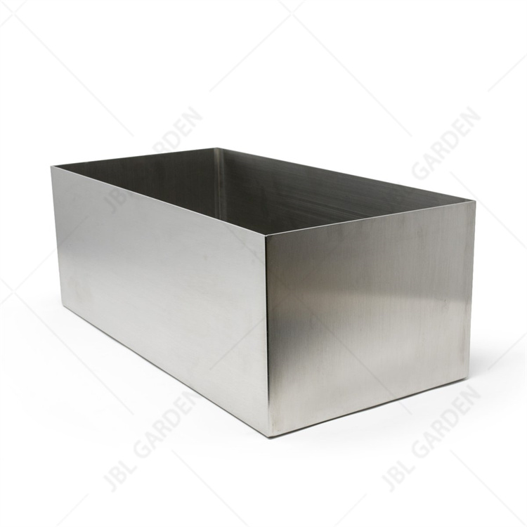
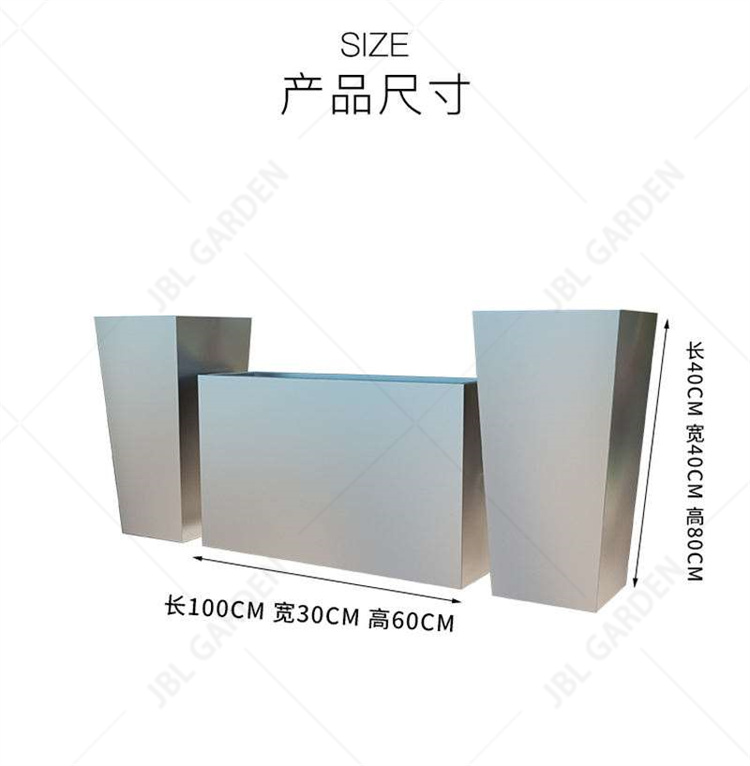
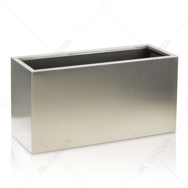
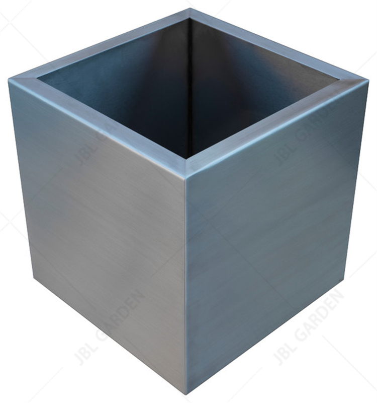
Stainless Steel Flower Planter
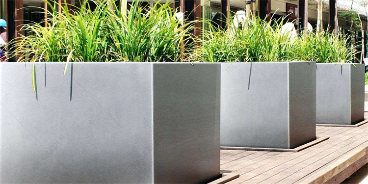
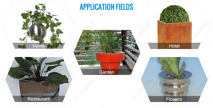
Great way to bring the outdoors into your space. Plant pots are perfect for growing succulents, grass, and small plants.
Contemporary Industrial Style - Stainless steel Flower Planter fits into any home décor with the simple shape and stainless steel material.
Included (4) low profile rubber pads - Easy to install, provides increased stability, and protects metal plant pots and the surface that you place it on.
The Stainless Steel garden pots helps you bring home a clean and sleek designer look. Perfect on the window sill, counter top, Fireplace mantle, and as a table's centerpiece. The heavy duty stainless steel is hand welded to ensure a water tight enclosure.
* EASY TO CLEAN: Like most stainless steel, finger prints and water spots may show. Simply use a damp towel, or a little window cleaner will take care of it. The plants depicted in the picture are not included with the purchase.
We also offer other steel materials,like Corten Steel Flower Planter,galvanized steel flower pots.

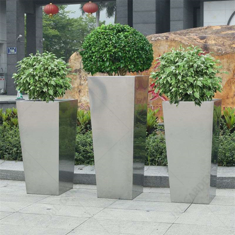

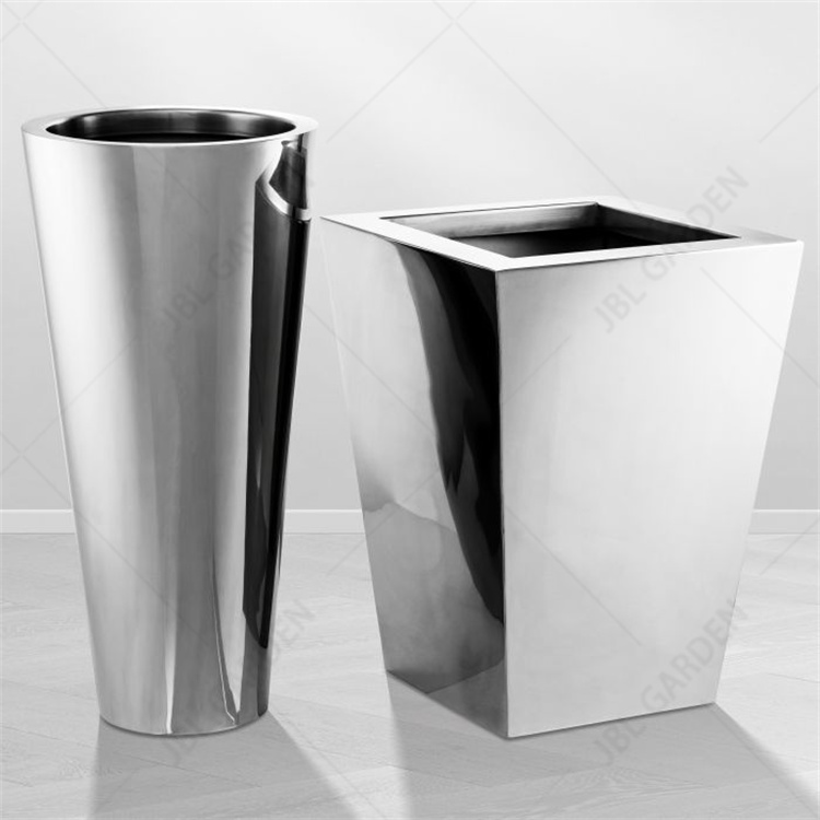
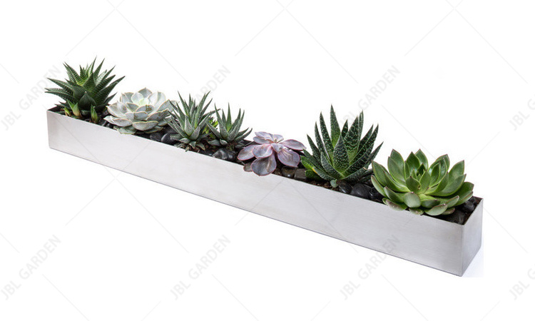
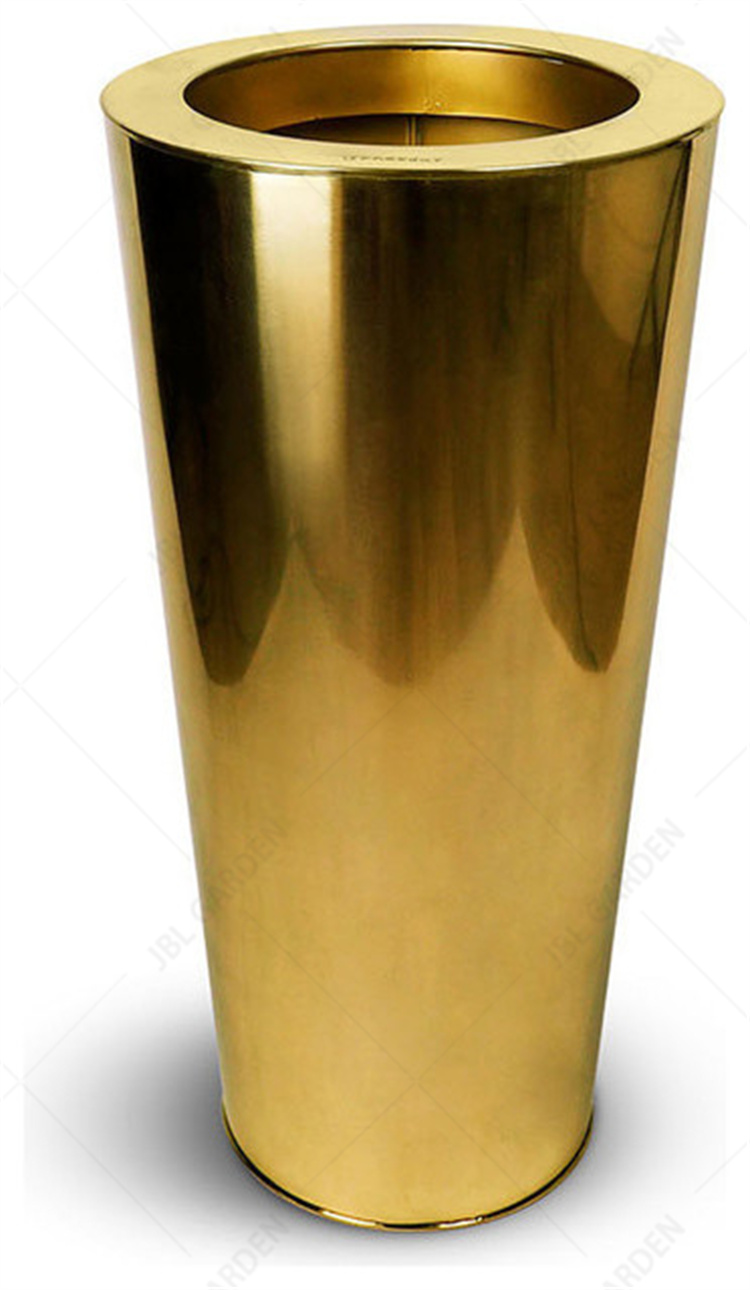
Stainless Steel Flower Planter Stainless Steel Flower Planter,Garden Plant Pots,Flower Pot Holder,Metal Plant Pots
Henan Jinbailai Industrial Co.,Ltd , https://www.hnjblbbq.com