How to continue consumer loyalty and freshness to the brand
In this era of “seeing the value of the face and the value of the faceâ€, it is crucial for the brand to continue the loyalty and freshness of the brand through the high value. Coupled with the "post-90s" new consumer mainstay, they have their own unique understanding of consumer shopping. The pure product efficacy does not attract their purchasing desires. They pursue new and individualized products. In the face of new brands and new products, they are often attracted by their packaging. Or unique, or stylish packaging that will inspire their buying impulses. What followed was that packaging design was put on the agenda by more and more companies and brands. As for packaging design, its so-called judging criteria have always been changing with the changes in the market. As a result, it is particularly important to grasp the current trend of packaging design.
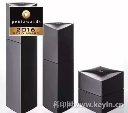
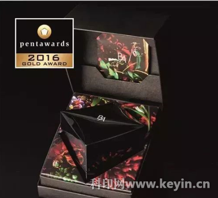
The cold black becomes popular, in order to look "advanced"
Intage, a Japanese market research company, conducted a color market research in 2013. As a result, black ranked first with 48.5% of the total, making it the most “luxury†color in the eyes of consumers in Asian countries such as China, Japan, Thailand and Vietnam. . That is to say, when it comes to "high-end products," people always look for black in the subconscious, just as Apple re-uses black when it releases the iPhone 7 five or six years later. Some people have also interpreted from the psychological point of view that most luxury brands choose black and white, in fact, they are all reducing the influence of color on people's emotions, and spawn a "high sense." In the packaging design world, the cool black color has also become popular.
Known as "The Lady's Love", Japan's top makeup brand POLA has updated its packaging for its classic Black BA Fu Yan Chenguang series. The black from the inside out wraps a mysterious and noble tonality, compared to the previous one. The gradient color packaging is more textured, and even some netizens commented that "it is really a top-notch luxury brand in Japan, and the packaging design of the black bottle series is like a work of art!"
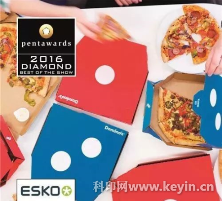
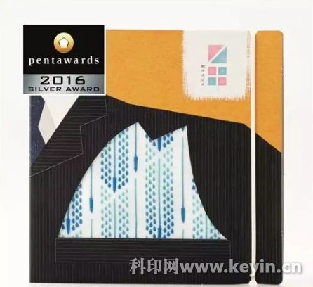
Simple and powerful packaging, easy to color
Minimal packaging design is difficult to do because it requires the most streamlined elements to convey the brand image. Its simplicity is powerful in the essence of the brand, the pursuit of simple and effective interaction, the rest is infinite The imaginary space almost excludes most of the complex design techniques, but it is the task that most tests the designer's skill.
For example, the Domino's pizza takeaway box with the 2016 Pentawards Highest Honor Diamond Award is from Jones Knowles Ritchie Design. Lee Rolston, Global Strategy Director of JKR, explained: “Damere is the largest pizza chain in the world, but now its packaging design has become a medium for all kinds of information, and the brand logo has been squeezed into the corner. To make Damme more eye-catching More easily recognized and remembered by consumers, we need to maximize its features and charm."
The JKR team boldly abandoned the cumbersome elements of the original Domino's box, leaving the brand's unique two-color logo blue and red, with eye-catching white dots. The JKR team explained that they have observed that the winners of the Pentawards Diamond Awards in 2007 have mostly followed the classic design principle of “less is more†by modernist master Mies Van Der Rohe.
Product "natural" performance
In the past, food packaging was mostly armed with food. Customers could only imagine the appearance of the product through the seemingly attractive illustrations and illustrations on the box. Generally, you would also see a small line of words that read "The picture is for reference only. The product is subject to the actual product."
Nowadays, the concept of health and organicity has come, consumers are more and more concerned, and merchants have also grasped the psychology of customers. On the shelves of supermarkets and convenience stores, there are more and more "natural" performances of goods, which seems to be visible. It has also become a standard for eating with peace of mind. The merchant then began to display the product itself inside the package in various ways, trying to convey fresh, natural information.
Many Japanese brands always have a sense of packaging design, such as Maruju, a 90-year-old dyed and weaving shop in Nagoya, Japan. They used the Menpu Masda series of handkerchiefs in this year to find the designer of the Peace Graphics studio. Hidekazu Hirai, in the form of cute illustrations, demonstrates that handkerchiefs can be used to wipe sweat, wipe tears, wipe the corners of the mouth after meals, and even show how to fold the handkerchief towel into the chest pocket of the suit jacket. Communicate the function of the product itself.


This kind of power system only include small wind turbine, controller, Inverter, battery, the whole system will be 24V or 48V, Power could be 600W / 800W / 1000W / 1500W / 2000W, and Off grid only. It cannot do on grid because of low power and low voltage ( system voltage need to be 220V or more if you want grid tied ). And because of the high freight fee, we won't suggest solar panels with it only if you insist. This power system is very cheap and could carry some lighting power and small appliances.
Free energy, Power system, Off grid energy system, Small 2KW power system
Wuxi Smaraad New Energy Technology Co., Ltd. , https://www.smaraadenergy.com